Android Menu Vs Action Bar with Example Code
Some of the most basic interactions with an app include buttons, lists and menus. This tutorial covers the basics of creating and using an Android Menu, and using an Android ActionBar, which supports menus.

(This Android menu tutorial assumes that Android Studio is installed, a basic App can be created and run, and the code in this article can be correctly copied into Android Studio. The example code can be changed to meet your own requirements. When entering code in Studio add import statements when prompted by pressing Alt-Enter.)
An Android Menu in Your App
In Studio start a New Project, here called Menu Demo, in the Create New Project wizard, at the Add an Activity... dialog, select Basic Activity. All other settings can be left at their defaults. This simple app shows the message Hello world! on the device screen. On the action bar, just below the notifications area, the three dots icon provides access to a one item Settings menu. (Early Android devices had a physical, hardware, menu key. The menu options appeared at the bottom of the screen when the hardware menu key was pressed.)
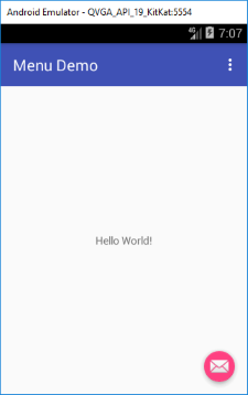
When the hardware menu key disappeared from Android devices, the dots icon, looking like vertical ellipsis, replaced it. This icon's functionality is referred to as the action overflow. However, due to it's stacked appearance, in this tutorial it will be referred to as the menu icon.
Defining and Showing the Android Menu Icon
Although the ActionBar holds the menu icon, the ActionBar is not supported on older Android Devices. Therefore, the Toolbar from the Android Support Library is used. Allowing an app to support the widest range of devices. For the Basic Activity used here, the Toolbar is defined in the AndroidManifest.xml:
<android.support.v7.widget.Toolbar
    android:id="@+id/toolbar"
    android:layout_width="match_parent"
    android:layout_height="?attr/actionBarSize"
    android:background="?attr/colorPrimary"
    app:popupTheme="@style/AppTheme.PopupOverlay" />
In the Activity's onCreate code (in MainActivity.java), the Toolbar is set as the app's ActionBar:
Toolbar toolbar = (Toolbar) findViewById(R.id.toolbar);
setSupportActionBar(toolbar);
The Activity class (and hence AppCompatActivity) has a method called onCreateOptionsMenu(). It is called when the menu icon (or key) is pressed. The Settings menu is shown using getMenuInflater().inflate(). It is passed the id of the menu definition, R.menu.main_main. This id comes from the name of the menu definition file menu_main.xml, stored in the res/menu folder in the project tree. If the file was called mymenu.xml then the id to reference it would be R.menu.mymenu. Here is the file generated for the default project:
<menu xmlns:android="http://schemas.android.com/apk/res/android"
    xmlns:app="http://schemas.android.com/apk/res-auto"
    xmlns:tools="http://schemas.android.com/tools"
    tools:context="com.example.menudemo.MainActivity">
    <item
        android:id="@+id/action_settings"
        android:orderInCategory="100"
        android:title="@string/action_settings"
        app:showAsAction="never" />
</menu>
Selecting the Settings menu item does nothing. There is no code that is activated by that menu item in the generated project. For such a simple menu the only item of relevance in the menu_main.xml file is the android:title attribute. It gets the Settings string from the strings.xml file in the res/values folder:
<resources>
    <string name="app_name">Menu Demo</string>
    <string name="action_settings">Settings</string>
</resources>
Calling Code from an Android Menu
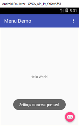
To respond to the Settings menu being pressed the Activity must override onOptionsItemSelected(). In this example it simply displays a message. Change the code at the bottom of the Activity's class to match the following (the Toast import will be required):
@Override
public boolean onOptionsItemSelected(MenuItem item) {
    // Handle action bar item clicks here. The action bar will
    // automatically handle clicks on the Home/Up button, so long
    // as you specify a parent activity in AndroidManifest.xml.
    int id = item.getItemId();

    //noinspection SimplifiableIfStatement
    if (id == R.id.action_settings) {
        //Menu item pressed
        Toast.makeText(this,"Settings menu was pressed.", Toast.LENGTH_SHORT).show();
        return true; //Indicated menu press was handled
    }

    return super.onOptionsItemSelected(item);
}
Alternative Menu Activation Code (Android 3.0 and Later)
From Android Honeycomb and latter (API 11+) an alternative to overriding onOptionsItemSelected() is to define a public method in the class (the method must take a MenuItem and return a boolean), then assign the name of that method to the android:onClick attribute in the menu definition, e.g.:
public boolean ShowMenuOption(MenuItem item) {
    //Menu item pressed
    Toast.makeText(this,"Settings menu was pressed.", Toast.LENGTH_SHORT).show();
    return true; //Indicated menu press was handled
}
And here's this method referenced in menu.xml.
<menu xmlns:android="http://schemas.android.com/apk/res/android"
    xmlns:app="http://schemas.android.com/apk/res-auto"
    xmlns:tools="http://schemas.android.com/tools"
    tools:context="com.example.menudemo.MainActivity">
    <item
        android:id="@+id/action_settings"
        android:orderInCategory="100"
        android:title="@string/action_settings"
        app:showAsAction="never"
        android:onClick="ShowMenuOption"/>
</menu>
(If an app contains both methods for calling code from a menu, onOptionsItemSelected() and android:onClick the former is used on pre-Honeycomb devices and the later on post-Honeycomb devices.)
Android Menu Item Shown in the Action Bar
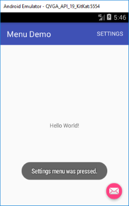
The menu item can be shown directly on the ActionBar/Toolbar. In the menu_main.xml file change the app:showAsAction="never" attribute (or android:showAsAction if not using AppCompatActivity) to ifRoom:
<menu xmlns:android="http://schemas.android.com/apk/res/android"
    xmlns:app="http://schemas.android.com/apk/res-auto"
    xmlns:tools="http://schemas.android.com/tools"
    tools:context="com.example.menudemo.MainActivity">
    <item
        android:id="@+id/action_settings"
        android:orderInCategory="100"
        android:title="@string/action_settings"
        app:showAsAction="ifRoom"/>
</menu>
The menu item is now shown instead of the menu icon:
Several Menu Items in an Android Menu
Add multiple item definitions to the menu's XML file to add other menu options:
<menu xmlns:android="http://schemas.android.com/apk/res/android"
    xmlns:app="http://schemas.android.com/apk/res-auto"
    xmlns:tools="http://schemas.android.com/tools"
    tools:context="com.example.menudemo.MainActivity">
    <item
        android:id="@+id/action_settings_1"
        android:orderInCategory="100"
        android:title="@string/action_settings_1"
        app:showAsAction="ifRoom"/>
    <item
        android:id="@+id/action_settings_2"
        android:orderInCategory="200"
        android:title="@string/action_settings_2"
        app:showAsAction="ifRoom"/>
    <item
        android:id="@+id/action_settings_3"
        android:orderInCategory="300"
        android:title="@string/action_settings_3"
        app:showAsAction="ifRoom"/>
</menu>
Obviously the different menu captions come from different string definitions:
<resources>
    <string name="app_name">Menu Demo</string>
    <string name="action_settings_1">Settings One</string>
    <string name="action_settings_2">Settings Two</string>
    <string name="action_settings_3">Settings Three</string>
</resources>
If the showAsAction="ifRoom" setting is present, but all the items do not fit on to the screen, then the menu icon allows access to the unseen items, hence why the icon is called the action overflow:
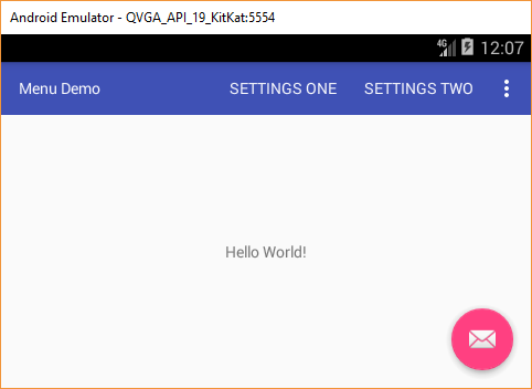
(Note: One advantage of using ifRoom is that it can reduce by one the number of times the user presses the screen. Instead of pressing the menu icon and then selecting the menu item, the user presses the item directly.)
Determining the Android Menu Item Pressed
In the method called by the menu item test the MenuItem id to see which one was pressed:
@Override
public boolean onOptionsItemSelected(MenuItem item) {
    boolean bRet=false;//set true if menu selection handled
    switch (item.getItemId()) {
        case R.id.action_settings_1:
            Toast.makeText(this,"Settings menu 1 pressed.", Toast.LENGTH_SHORT).show();
            bRet=true;
            break;
        case R.id.action_settings_2:
            Toast.makeText(this,"Settings menu 2 pressed.", Toast.LENGTH_SHORT).show();
            bRet=true;
            break;
        case R.id.action_settings_3:
            Toast.makeText(this,"Settings menu 3 pressed.", Toast.LENGTH_SHORT).show();
            bRet=true;
            break;
        default:
            bRet=super.onOptionsItemSelected(item);
    }
    return bRet;
}
Android Menu and ActionBar Icons
Android menu items support the showing of individual icons. First some info on ActionBar and Menu icons before showing how to add them.
As with other Android icons, such as the launcher icon, the style and size requirements of the menu icons have changed over the years that Android has been around. Because of these changes there is a lot of conflicting information on the Internet about Android icon sizes, styles and colors. The problem is complicated if apps want to support multiple older Android versions. On top of that is the need to support the wide arrange of screen densities present on Android devices. Fortunately a few shortcuts can be employed to reduce the number of different menu icon combinations that need to be provided with an app.
Google design guidelines for ActionBar icons are that they are 24x24 pixels (px) for baseline screen density, i.e. for a medium density screen. Previously (pre-ActionBar) the standard menu icon image size was also 24x24 px but sitting within a 32x32 px icon size, i.e. 4 px border around the image. Plus going back further, pre-Honeycomb, the menu icon was a 32x32 image sitting inside a 48x48 icon size. Fortunately there are not many older versions of Android being used anymore, and with the ActionBar being used to support an Acitvity's menu, then the 24x24 px icon can used for all menu icons.
Menu and ActionBar icons are a flat image in a single color, usually grey. For a light theme the icon's color is dark grey (RGB hex #333333) with 60% opacity, and for a dark theme the icon color is white (RGB hex #FFFFFF) with 80% opacity. The parts of the icon that are not the image are transparent. This allows the icon to sit cleanly on the background.

For examples of icons look in the sub-directories of the data directories, under the various platforms in the Android SDK install location. The icon file names normally start with ic (ic_menu... for menu icons and ic_launcher... for launcher icons), this is a naming convention and not an absolute rule. At the Material Design web site there are some icon examples.
Why Light and Dark Android Menu Icons?
When developing an app it is possible to change the UI look by applying styles to the various screen elements. These styles collectively are known as a Theme. From Android 5.0 (API level 21) the Material Theme was introduced, including Material Dark and Material Light. From Android 4.0 (API level 14) three themes were provided by the OS, Holo Dark, Holo Light and Holo Light with Dark Action Bar. The Holo themes were present in Android 3.0+ (API level 11), however, they could be changed by the device manufacturer, as some manufacturers did in earlier devices. The Holo themes were not present prior to Android 3.0. Thus the system theme prior Android 3.0 is different to the Holo themes. The Android Gingerbread release (API level 9) system theme also differed from previously releases. Finally there are rooted devices running custom Android builds that can have different themes.
With all these themes their are potential styling problems. Standard UI elements, that are not styled with a custom theme, may need to deal with dark and light theme versions. For example setting a light text on a UI element might not work on all devices because of the different themes. A menu item is one of the problematic elements. Depending upon the device the app is running on, the menu item will have a dark background with white text, or a white background with dark text, and, therefore, if menu icons are being used, the need for dark and light icons.
This is not a problem if an app is being styled with a custom theme where all the elements have been designed. However, styling an app can be a large chunk of work. This is why some developers are happy to use the devices standard theme.
How does this affect icons? Without styling it is not known if an icon is guaranteed to sit on a light or dark background. However, one of the easiest solutions is to deploy an icon that is dark grey with a very light or white border. That way one icon can be used for both dark and light backgrounds:
![]()
Generating a Menu Icon Quickly
If there is little time to design the various icons required in graphics packages then Android Studio provides a useful tool. In Studio a menu icon can be added to a project quickly using the in-built Asset Studio. With the app project open, use the File menu, then New and Image Asset.
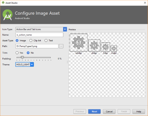
Although at the time of writing the Asset Studio was still creating the older 32x32 px size icons and not supporting every density. However, the generated icons still work.
Setting an Android Menu Icon
To set a menu icon for an Android settings menu first add the icon files to the res/drawable folders. Then in the menu's XML file assign it to the android:icon attribute:
<menu xmlns:android="http://schemas.android.com/apk/res/android" >
    <item
        android:id="@+id/action_settings_1"
        android:icon="@drawable/gear1"
        android:showAsAction="ifRoom"
        android:title="@string/action_settings_1"/>
</menu>![]()
To display only the icon or only the text, remove the appropriate attribute. The text can be displayed by adding withText to the showAsAction attribute. Then if the action bar has room for both the menu icon and the menu text both are shown:
![]()
Android Menu Icon Physical Size
Sizes of screen elements should be, and are normally, specified in density pixels. A density pixel is apporoximately the same size on all device screen densities. There are several screen densities, low (LDPI), medium (MDPI), high (HDPI), extra high (XHDPI), extra extra high (XXHDPI), and extra extra extra high (XXXHDPI). The basic ratios of the different density screens are illustrated in this graphic (see Supporting Different Densities at Android Developers):

The low screen density is no longer popular and is no longer supported by many apps. Medium density is the base size where one physical pixel is approximately the same size as one density pixel. The other density sizes are multiples of the medium density. What this means is that to supply a menu icon that looks good on a range of devices provide a bitmap for each density:
- LDPI = MDPI x 0.75 = 24 x 0.75 = 18×18 pixel icon, store in res/drawable-ldpi
- MDPI base 24×24 pixel icon, store in res/drawable-mdpi (and res/drawable for Cupcake)
- HDPI = MDPI x 1.5 = 24 x 1.5 = 36×36 pixel icon, store in res/drawable-hdpi
- XHDPI = MDPI x 2 = 24 x 2 = 48×48 pixel icon, store in res/drawable-xhdpi
- XXHDPI = MDPI x 3 = 24 x 3 = 72×72 pixel icon, store in res/drawable-xxhdpi
- XXXHDPI = MDPI x 4 = 24 x 4 = 96×96 pixel icon, store in res/drawable-xxhdpi
The source code for the menu demo app used in this article is available to download in menu-demo.zip and import into Android Studio. The menu demo code is also available from the Android Example Projects page.
See Also
- See the Context Menu Example for Android for a pop-up menu example.
- See the Android Example Projects page for lots of Android sample projects with source code.
- For a full list of all the articles in Tek Eye see the full site alphabetical Index.
Author:Daniel S. Fowler Published: Updated:


