Grid CSS Old Skool
In this article a Cascading Style Sheets (CSS) for a web page layout, following a grid pattern, is discussed. This grid CSS, available from Github, does not use the CSS grid property, instead it is based upon Skeleton CSS to allow support for older browsers and devices. A grid layout allows a website to support different types of device screen and screen resolutions. Websites need to look good on mobile phones, tablets, personal computers and smart televisions. Using the grid CSS is discussed below after the background introduction.

Back to the Grid for Long Form Content
There are many ways to design a web page. Different styles of web page design have come into fashion then been replaced with something new. The Infinite Scroll was invented in 2006 by Aza Raskin and is very popular. Infinite Scroll helps user engagement and is argued to increase browsing addiction. Infinite Scroll is good for chunky content and websites with a few informational pages, but it is not necessarily great for long-form content seen in lengthy articles and blog posts. Furthermore, websites will need other items placed around the long-form content. The surrounding additional information can include:
- the website title and header;
- links to other pages and content;
- maybe advertising to fund the website;
- legal information.
For example here is the web page layout used at Tek Eye:
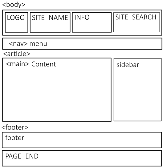
Supporting the various web page elements, the multiple screen sizes and different device types can be done using a responsive web design. What is a responsive web design? Responsive web design is where the same website code or mark-up responds to the device that is loading the web page. A responsive website detects the size, resolution and pixel density of the device screen and adjusts the text, image size, and layout of page elements most suitable for the device screen. The use of a grid layout can help with responsive web design.
Popular Browsers Support the CSS Grid Property
Specific support for a grid layout within CSS has been in development for a few years, with the latest versions of the most popular browsers now providing what is known as Level 1 support. For more information on the CSS grid property see these resources:
- A Complete Guide to Grid, CSS Tricks summarises the new CSS grid options.
- Mozilla covers the latest CSS Grid Layout in detail
- The CSS Grid Layout in Grid by Example
However, to support older devices and browsers an alternative to the newer grid property is required. This article covers a grid layout using well-established CSS properties.
HTML Grid Layout without CSS Grid Property
The CSS for the grid layout is called grid.css and is available from GitHub. To use, create a web page, then add a link for the grid CSS file. Plus, the CSS file normalize.css can be used to baseline browser styles if required. Here is a starting page HTML page for grid.css, it assumes that grid.css has been saved in a css folder below the where the HTML file is stored. This starting web page uses normalize.css by linking to a content distribution network (CDN) version (alternatively normalize.css can be saved into the css directory):
<!DOCTYPE html>
<html>
    <head>
        <meta charset="utf-8" />
        <meta name="viewport" content="width=device-width, initial-scale=1.0" />
        <title>A Grid CSS Web Page</title>
        <link rel="stylesheet" href="https://cdn.jsdelivr.net/npm/normalize.css@8.0.1/normalize.min.css">
        <link rel="stylesheet" href="css/grid.css">
   </head>
    <body>
        <div class="container">
            <div class="row">
                <div class="twelve columns">
                    <p>Header</P>
                </div>
            </div>
            <div class="row">
                <div class="eight columns">
                    <h1>A Grid CSS Web Page</h1>
                    <p>Hello World!</p>
                </div>
                <div class="four columns">
                    <p>Sidebar</p>
                </div>
            </div>
            <div class="row">
                <div class="twelve columns">
                    <p>Footer</P>
                </div>
            </div>
        </div>
    </body>
</html>
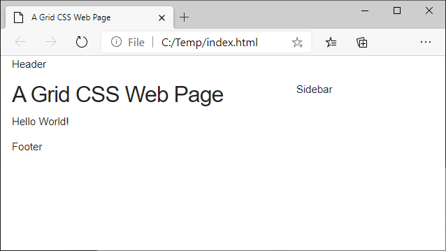
Here is the page loaded in a browser:
Rows and Columns in the HTML Grid Layout
Web pages using grid.css for page layout are designed around various column sizes (set within rows). The maximum number of columns across a page is twelve, the minimum is one. Therefore, a column width can be anything from one to twelve. The number twelve is good for laying out equal width columns for various page items. For example, a side-by-side layout uses two columns of width six (6+6=12). For three equal columns use columns with a width of four (4+4+4=12). In the above starting grid layout web page, the header and foot is of width twelve and the main content and sidebar are of widths 8 and 4 (8+4=12).
Notice the use of div HTML elements to construct the various web page elements, and the divs are styled with a class name to give the column width. All the columns styled divs sit within row styled divs. All row and columns divs sit inside a top level container div. The container uses auto left and right margins to center the web page contents in the browser window. The container has a maximum width of 1200 pixels.
It is a Responsive Grid CSS
One of the key lines for a HTML page to support multiple screen resolutions is a meta data line in the HTML web page:
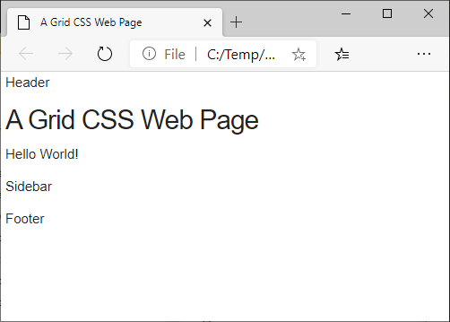
<meta name="viewport" content="width=device-width, initial-scale=1.0" />This has the effect of zooming up web pages for devices with very high dots-per-inch (DPI) screens, i.e. mobile devices that have DPIs a lot bigger than desktop monitors. Furthermore, the Grid CSS code caters for narrow device screens. When the browser width is reduced the sidebar text drops below the content:
An Old Skool Grid CSS Test Page
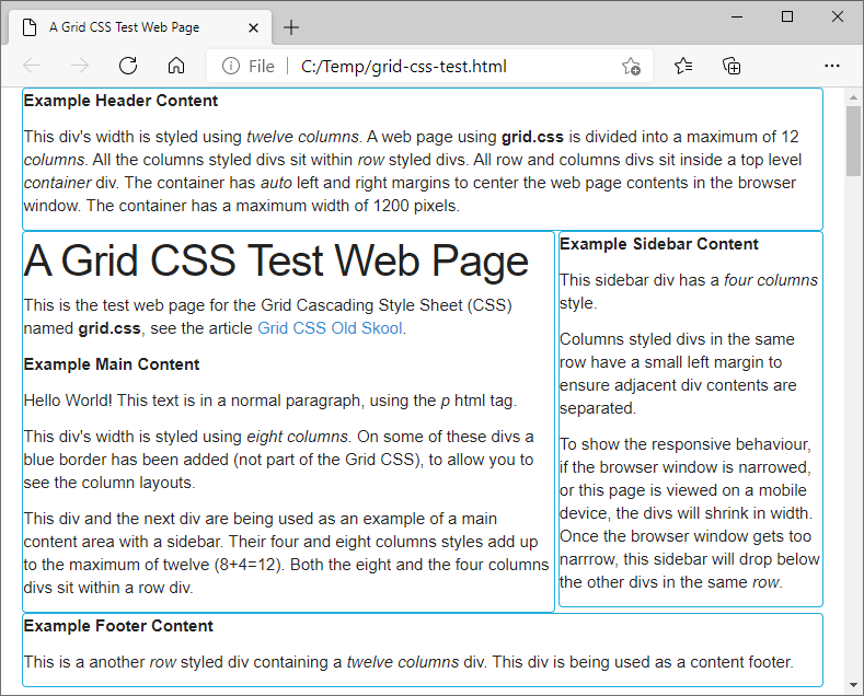
The Grid CSS Test Page provides a full demo of the Grid CSS style sheet. It shows the layout of the columns and the styling of other HTML elements, including:
- header
- button and anchor (link)
- label and input for form
- ordered and unordered list
- code and pre
- table
- image
- a nav menu
When designing a grid HTML layout it is sometimes useful to see the grid in action. This can be done by adding a border to divs. This is done to the example page from above by declaring an an addborder style class:
<!DOCTYPE html>
<html>
    <head>
        <meta charset="utf-8" />
        <meta name="viewport" content="width=device-width, initial-scale=1.0" />
        <title>A Grid CSS Web Page</title>
        <link rel="stylesheet" href="https://cdn.jsdelivr.net/npm/normalize.css@8.0.1/normalize.min.css">
        <link rel="stylesheet" href="css/grid.css">
        <style>
            .addborder {border: 1px solid black;}
        </style>
    </head>
    <body>
        <div class="container">
            <div class="row">
                <div class="twelve columns addborder">
                    <p>Header</P>
                </div>
            </div>
            <div class="row">
                <div class="eight columns addborder">
                    <h1>A Grid CSS Web Page</h1>
                    <p>Hello World!</p>
                </div>
                <div class="four columns addborder">
                    <p>Sidebar</p>
                </div>
            </div>
            <div class="row">
                <div class="twelve columns addborder">
                    <p>Footer</P>
                </div>
            </div>
        </div>
    </body>
</html>
In the Grid CSS Test Page a border is shown to demonstrate the grid in action. Shrinking or stretching the browser window on a computer running the grid CSS test page will show the grid CSS in action:
The grid CSS is a good starting point for a useful a flexible layout for HTML web pages. It is used as the basis for web page layouts in the ↓markdown↓ Content Management System (CMS). ↓markdown↓ CMS is probably the easiest way to publish web pages.
See Also
- Grid CSS on Github
- Hello World in HTML
- Announcement of the Humanized Reader, a.k.a. Infinite Scroll
- The first Infinite Scroll in action.
- Newer CSS Grid Layout at Mozilla Web Docs
- For a full list of all the articles in Tek Eye see the full site alphabetical Index.
Author:Daniel S. Fowler Published:


