What are DPI, DIP, DP, PPI, SP and Screen Resolutions in Android?
This article provides an overview of Android screen densities, and the various acronyms that occur when dealing with a device’s screen. Read this article to gain an understanding of how Android handles different density screens. Some simple example code is provided to illustrate some of the points made.

Understanding Android Screen Densities and Terminology Intro
Android’s popularity as a mobile device Operating System (OS) has resulted in a proliferation of hardware on the market. This has provided great choice for the consumer and forced continuous innovation from the manufacturers. In a few short years there has been rapid innovation in all areas: CPU capabilities, memory size, form factors, keypads, cameras, sensors, batteries, power consumption and screen technologies. The screens have been getting bigger, thinner, sharper, tougher and more responsive to touch. This has forced the Android SDK to move rapidly with the hardware technology (and the hardware to feed upon Android ideas). Explained here is how the variety of screen sizes are handled by the Android OS, finishing with a summary table of the acronyms covered. Example code is provide to show different screen densities in action.
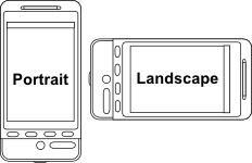
What makes up an Android Screen
If you are new to technology here’s how a device screen works. The screen is made of thousands of small dots called pixels arranged in a grid. The pixels running from left to right are known as the X pixels or X-axis. The pixels running from top to bottom are known as Y pixels or Y-axis. The resolution of the display is the number of pixels in the X-axis multipled by the number of pixels in the Y-axis. A 320 by 480 display will have 320 pixels in the X-axis and 480 pixels in the Y-axis, this will also be stated simply as or 320x480 (and in this case x is the multiplication, or times, sign and not the X-axis).
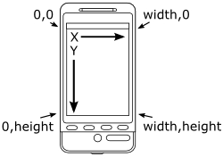
To show an image on the display the color of the pixels are set by a program running on the device. (Look at the article How Computer Screens and Printers Show Images for more details on how dots make up an image.) Because the Android coordinate system runs left to right and top to bottom, plotting a line from 0,0 to 100,100 results in a line that slopes down from the top left of the screen (compared to one that slopes up from bottom left on a normal maths chart). There is a huge variety of screens seen on Android devices, just look at the thousands of devices listed on https://www.gsmarena.com/ to see the large number of different types of screens that Android needs to handle.
What is Screen Density and How it is Calculated
Generally the more pixels, px for short, that are squeezed into a screen the sharper any images shown on the screen will look. The higher the screen density (pixel density) the more pixels are in a given area of the display. Early phones had low density screens and individual pixels could be made out if you looked closely at the screen. Modern phones have high density screens with pixels not visible to the naked eye. An old 320 by 480 px phone screen has a total of 153,600 pixels. A full high definition (HD) phone screen is 1080x1920 px, or over 2 million pixels (2,073,600).
The size of the pixels determines the size of the screen. All the full HD pixels could fit into a 5″ screen (e.g. a HTC One M9) or a 6.4″ screen (e.g. Lenovo Phab2 Plus). The smaller screen is denser because it has more pixels in a smaller space.
What is Screen Size
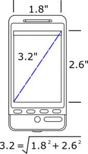
The size of a screen, for a smartphone, tablet, laptop, computer or television, is usually given as a single figure in inches (one inch is 2.54 centimetres). This figure is a measurement of the corner to corner diagonal of the visible area of the screen, usually rounded to one decimal place. Simply measure the diagonal to get the screen size. Although if you know the height and width of a screen you can calculate the screen size using the Pythagorean theorem, which gives the screen size as the square root of the height squared plus the width squared.
Pixel Density
The screen density is quoted as Pixels Per Inch, PPI, and is the number of pixels that fit into an inch. The higher the number then the sharper images look on the display, therefore consumers consider a high PPI figure an advantage when buying a device. Sometimes the figure is quoted as Dots Per Inch, DPI, though the use of DPI is confusing as it comes from printing terminology, and it can refer to the sensitivity of the sensors in digital scanners and digital cameras. For Android screens when it comes to PPI vs. DPI use PPI and leave DPI to refer to printers, where it is really a different measurement (because the dots needed to produce high quality images on paper are of greater density).
The PPI figure for a screen can be calculated given the resolution (number of x and y pixels) and size (diagonal measurement of the visible area) of a screen. Use the Pythagorean theorem to calculate the number of pixels in the diagonal then divide the result buy the screen size. i.e. PPI=(square root of (x^2 + y^2))/screen size.
Example PPI Calculations
Using a couple of old Android devices as an example. For a HTC Wildfire S with a 3.2″ screen at 320×480 px. Square the x (320x320) to give 102,400. Square the height (480x480) to give 230,400. Add the two squares together giving 332,800. Talk the square root to give 576, to the nearest integer. Then divide by the screen size (576/3.2) to give the screen density as 180 PPI. For the HTC ChaCha which has the same resolution screen but a a smaller screen size, 2.6″, the figure is 221 PPI (i.e. 576/2.6). The HTC Wildfire S was an upgrade to the HTC Wildfire. The original HTC Wildfire had 3.2″ screen at a resolution of 240×320, therefore for the density it is the square root of (240^2+320^2) divided by 3.2 = 125 PPI.
Two more examples. The HTC One M9 has a 5" screen and Lenovo Phab2 Plus has a 6.4" screen, both are full HD (1080x1920 px). The square root of 1920^2+1080^2 is 2202. Divide by 5 gives 440 PPI for the HTC One M9, and divide by 6.4 gives 344 PPI for the Lenovo Phab2 Plus.
A Wide Range of Screen Densities
As the technology behind displays has increased the PPI figures for new devices has increased. It was common for computers to use 72 or 96 PPI for displays. Mobile devices started from around 100 PPI then rapidly increased to over 300 PPI. On the latest hi-resolution displays full HD is considered average, with 440 PPI or higher expected, some high end devices exceed 500 PPI. Once over 300 PPI the human eye cannot see the individual pixels, hence Apple calling their high resolution screens Retina Displays (the original Retina iPhones started at 326 PPI). Screens carry on getting denser, with the Galaxy S8 having around 570 PPI, even though most software will never need to use a density that high.
Dealing with A Variety of Screen Densities
Android can handle a wide range of screen densities. It does so by classing a display as either:
- Low density
- Medium density
- High density
- Extra high density
- Extra extra high density
- Extra extra extra high density
In Android code the DisplayMetrics class can be used to read the device density, and the screen size in pixels. The medium density setting is the reference point, at this point Android takes 160 PPI as the default. If a device has a screen density around this figure (it does not need to be exactly 160 PPI, a 180 PPI screen could be medium density), then a resource, such as a image file, is displayed at the original size, with no scaling. Then for lower and higher densities the image file may be scaled up or down so that it is displayed correctly on the screen.
When Android was first released the resources used in an app would be stored in a folder called drawable. To supported different screen densities four more folders were introduced: drawable-ldpi, drawable-mdpi, drawable-hdpi and drawable-xhdpi. These folders allow pre-scaled resources to be included in an app. This supports better quality interfaces because scaling a resource can introduce pixelation (images becoming ragged) or loss of detail. The scaling factors are 0.75 for low density, 1.5 for high density and 2 for extra high density. These factors mean that a low density screen is 120 PPI (0.75 x 160 PPI), high density screen is 240 PPI (1.5 x 160 PPI) and extra high density is 320 PPI (2 x 160 PPI). The original drawable folder was supported for backwards compatibility, it mimics the contents of drawable-mdpi. As screen densities continued to increase the folders drawable-xxhdpi, 480 PPI (3 x 160 PPI), and drawable-xxxhdpi, 640 PPI (4 x 160 PPI) were added to Android. The abbreviations are:
- LDPI – Low Dots Per Inch (no longer seen in use)
- MDPI – Medium Dots Per Inch
- HDPI – High Dots Per Inch
- XHDPI – Extra High Dots Per Inch
- XXHDPI – Extra Extra High Dots Per Inch
- XXXHDPI – Extra Extra Extra High Dots Per Inch
The relative sizes are shown in this graphic:
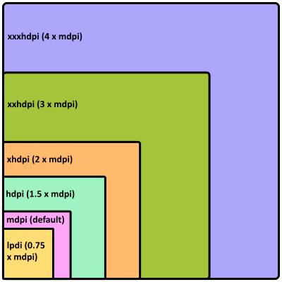
To display an image in an app it can be dropped into the MDPI folder (res/drawable-mdpi) and it will be used on all screen densities, scaled by Android. It is better to design a high density image in a graphics package and produce the low (75%), medium (100%), high (150%), extra high (200%), extra extra high (300%), and extra extra extra high (400%) versions. The resize factors (based on the medium density being 1.0) are 0.75 for low density, 1.5 for high density, 2 for extra high density, 3 for extra extra high density, and finally 4 for extra extra extra high density.
Android Image Sizes in Code
When working with resources in code the sizes can be set in pixels using the abbreviation px. Using px would not be good for the app as it would not be independent of the device’s screen density. Instead refer to image sizes in terms of density pixels, dp. One dp is the same as one physical pixel on a device with a medium density display. For a low density display one dp is 0.75 of a physical pixel, for a high density display 1 dp is 1.5 the size of the pixel, and likewise 1 dp is twice the size of a pixel on an extra high density display. This is illustrated with the recommendations for the launcher icons for apps:
- LPDI – 36 pixel diameter for round icons, 36x36 pixels for square icons (0.75 * MDPI size)
- MDPI – 48 pixel diameter for round icons, 48x48 pixels for square icons
- HDPI – 72 pixel diameter for round icons, 72x72 pixels for square icons (1.5 * MDPI size)
- XHDPI – 96 pixel diameter for round icons, 96x96 pixels for square icons (2 * MDPI size)
- XXHDPI – 144 pixel diameter for round icons, 144x144 pixels for square icons (3 * MDPI size)
- XXXHDPI - 192 pixel diameter for round icons, 192x192 pixels for square icons (4 * MDPI size)
See the images at the free Android graphic resources page for examples of different icons, the zip files store the various sizes.
(As well as px for pixels other absolute sizes include in for inches and mm for millimetres.)
Density Differences Code Example
Android Virtual Devices (AVDs) that come with the Android SDK support different screen densities so that apps can be tested on the various resolutions they will encounter in the marketplace. In this example a fixed size image will be displayed next to an image that is drawn from one of the resource folders (depending upon the density of the device screen). Start by creating a new Android project in Studio (for new programmers see Your First Android Hello World Java Program to see how). Here the project is called Density Test.
The image used for the different density drawable folders is the Home Icon found on the Android graphic resources page. Download the home_icon.zip file, which can be used to add all the graphics into a project. Extract the home icon resources into the res folder of the project (preserving the directory structure in the zip file).

The image for the fixed sized graphic is simply a 50 x 50 pixel box. Also provided in the zip file. Alternatively create one in a drawing program or use the context menu, usually right-click, on the image below, save it as pixels50x50.bmp. In the res folder create a drawable-nodpi folder to hold it. (The res/drawable-nodpi folder signifies that images in that folder should be used independent of the devices screen density). Note that PNG files are valid for no DPI drawables as well.
![]()
In the Android project two ImageViews are place next to each other in an Activity’s layout. One for the 50x50 image, one for the Home Icon, as in this example layout:
<RelativeLayout xmlns:android="http://schemas.android.com/apk/res/android"
    android:layout_width="match_parent"
    android:layout_height="match_parent">
    <ImageView android:id="@+id/imageView1"
        android:layout_width="wrap_content"
        android:layout_height="wrap_content"
        android:src="@drawable/home" />
    <ImageView android:id="@+id/imageView2"
        android:layout_width="wrap_content"
        android:layout_height="wrap_content"
        android:layout_alignTop="@+id/imageView1"
        android:layout_toRightOf="@+id/imageView1"
        android:src="@drawable/pixels50x50" />
</RelativeLayout>
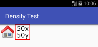
Here is the app running on an MDPI screen. Notice that the 48x48 pixel item is roughly the same as the 50x50 pixel bitmap. This is expected for medium density screen. (The code as a Android Studio project is in the density-test.zip file, available from Tek Eye's Android Example Projects page.)
In Studio when the screen layout is viewed on the Design tab different screen types can be previewed (using the Device in Editor drop down). Here a Nexus One (HDPI), a Nexus 4 (XHDPI), and Google Pixel (XXHDPI) screen are used to preview the screen layout. Notice how the icon appears roughly the same size (pulled from the correct density folder to compensate for the increase in screen resolution). However, the fixed sized bitmap appears to shrink, in fact it stays the same size but requires less screen space because more pixels fit into a given area on the higher density screens:

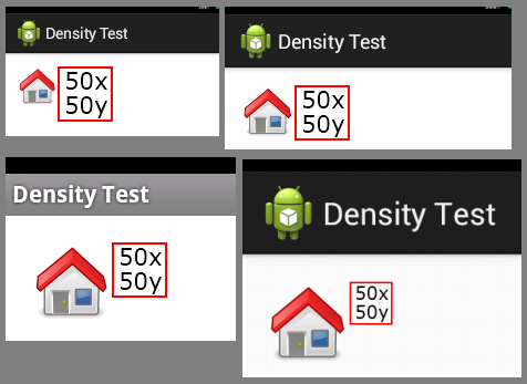
Here is a composite of the example running on older devices featuring Low, Medium, High and Extra High density screens. Again as the density increases the icon remains the same size but the fixed 50x50 bitmap appears smaller and smaller.
Android Fonts Use Scaled Pixels
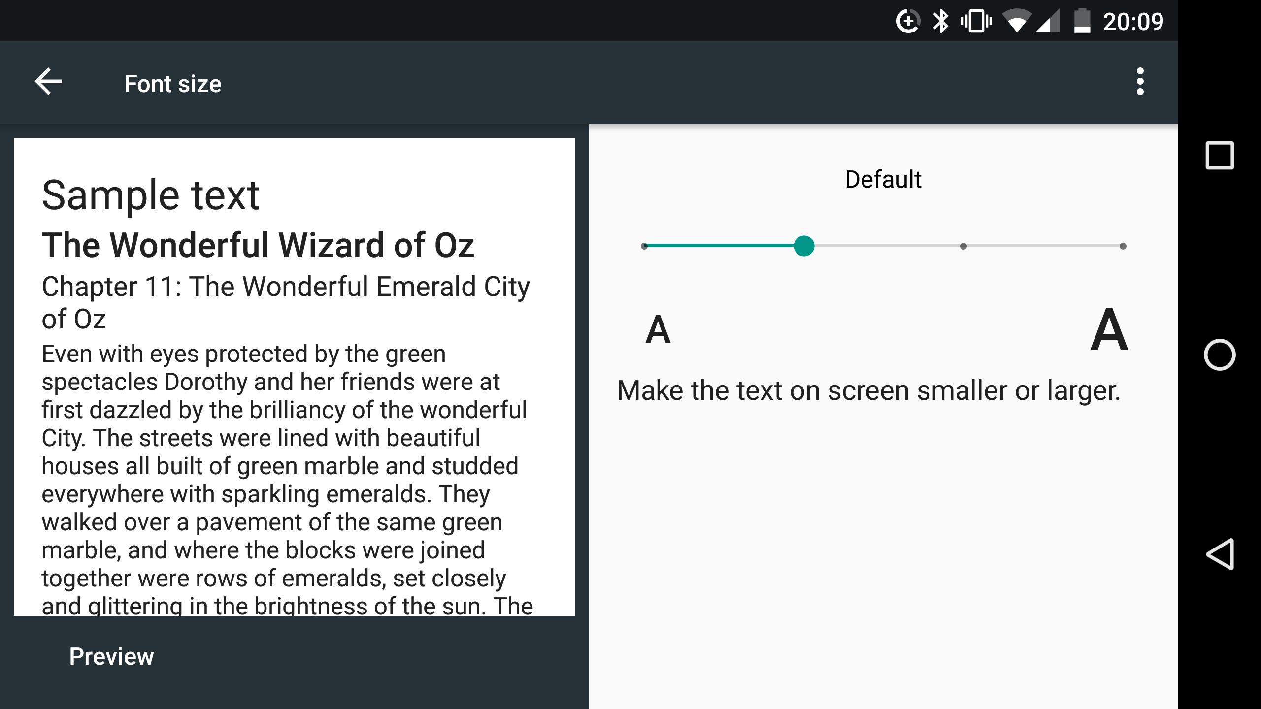
Whilst the density pixel, dp, setting is suitable for images and other screen elements there is another problem when using fonts. This is because device users can set a font size, to help them increase or decrease the default displayed text size appropriate to their needs. (They may have good or bad eyesight.)
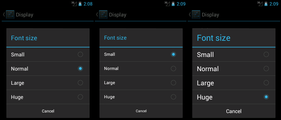
On older devices it may appear as a list:
The link between the users chosen text size and the text in your app is not dp (density pixel), or one of the other supported font measurements (pt for point, in for inches), but scaled pixels, sp. By setting the size of text in user interface (UI) elements in terms of sp, apps take into account the user’s text preferences. See the article Changing the Font for Android TextViews and EditTexts for more on changing app fonts.
Summary
There is a wide variety of screen types used by Android devices. The Android OS has built in support to handle the wide range of screens. By writing apps using the latest APIs and using the dp and sp measurements it is possible to support the variety of screen sizes and resolutions. The low density screens are no longer that important for future app development, as shown on the Android Developers Dashboards. Supporting layouts for mobile phones and tablet devices at medium density and higher ensures a near total market coverage.
List of Android Screen Acronyms and Glossary
| Acronym | Meaning | Description |
|---|---|---|
| AVD | Android Virtual Device | A computer programme on an app developer’s machine that mimics a real Android device. AVDs allow developers to test on a wide range of devices without needing to physically own those devices. |
| DIP | Device Independent Pixel | Also knowns as density independent pixel. A virtual pixel that appears approximately the same size on a variety of screen densities. |
| DP | Density Pixel | See DIP above. |
| DPI | Dots Per Inch | For an image built of dots (pixels) how many of those dots fit into an inch (2.54 centimetres). The higher the DPI the denser the image and the better the perceived quality. For a given fixed image size, the higher the DPI the smaller the image. DPI is common in terminology for printers, use PPI for screens. |
| GUI | Graphical User Interface | The screen of an Android device is composed of a variety of graphically drawn components control by the app and drawn by the OS. |
| in | Inch | A unit of measurement for Android screen UI items, 1 inch = 25.4mm. |
| mm | Millimeters | A unit of measurement for Android screen UI items, 25.4mm = 1 inch. |
| OS | Operating System | The software built into an Android device to control how it works and allow apps to work with the sensors and screens. |
| PPI | Pixels Per Inch | For Android devices the same as DPI. |
| pt | point | An Android supported mesaurement size for text. |
| px | pixels | An Android supported mesaurement size for screen UI items. |
| SDK | Software Development Kit | Programming tools and code libraries to help develops write software for a platform. A SDK is available for Android. |
| sp | Scaled Pixels | An Android supported measurement size for text. |
| UI | User Interface | See GUI. |
See Also
- The images used in the Density Text example project are also in the home_icon.zip file.
- See the other Android Studio example projects to learn Android app programming.
- See the list of all the Android articles on this website in the site's index.
Turning Off Android Screen Compatibility Mode
When support was introduced for larger, high resolution displays, Android needed a way to display the old apps, designed for small low resolution screens, correctly on the bigger display devices. To do this they introduced a Screen Compatibility Mode. This automatically assumed an old app, compiled against a very old version of the SDK, is not designed for larger screens (unless told otherwise). The app is given a virtual 320×480 screen which is scaled up to the size of the larger screen. To support larger screens, and prevent this lower resolution scaled screen (the Screen Compatibility Mode), the larger screen support must be declared. This is done in the app's manifest by inserting <supports-screens android:xlargeScreens=”true” /> in the manifest file (AndroidManifest.xml) as a child of the manifest root. Alternatively compile the old app against a newer API. Remember to test an old app’s layouts with the bigger screens.
Archived Comments
John on March 12, 2015 at 8:58 am said:
Hi, thanks for the article. I am very confused about DPI. Take this example: 800×480, 9 inch screen. DPI said to be 160 (standard mpdi).
Where does this 160 come from? It does not match the PPI, which is 103.66 (square root of [800squared + 480squared]).
I have no idea where the 160DPI comes from. Several benchmark apps confirm the device is 160DPI, I’m lost.
Thank you!
Tek Eye on March 12, 2015 at 11:46 am said:
Hi, this can happen. Firstly on lower cost devices manufacturers can try to make the device specs. appear better than they really are. Is 9″ the actual visible diagonal of the screen? Check with a ruler. Some devices can be smaller than stated. However, the real reason may be due to using big, but low PPI, screens. The manufacturer can set the internal DPI in the operating system to be different from physical PPI (infact it is rarely an exact match). For example the original Samsung Galaxy Tab had a medium density display but reported a high density display. Here you have a low density display reported as medium density. In both cases the icons and graphics will be scaled one size higher than required and take up more physical space on a screen, which the manufacturer may think looks better for the larger screen (reducing spacing between icons). In other words the manufacturer is massaging the DPI setting to keep the UI looking correct. The internal conversion from density pixels (DPI) to physical pixels (PPI) compensates for physical screen size considerations.
MK Bukhari on January 13, 2016 at 12:07 pm said:
Hi, I read your comment but I am a little bit confused about the conversion of ppi into dpi. Can u please share the formula, how can we convert ppi to dpi. Thank you in advance.
Tek Eye on January 20, 2016 at 11:18 am said:
This is covered in the article. Square the values for the number of X (width) and Y (height) actual pixels. Add the two squared answers together. Take the square root of that sum and divide it by the diagonal measurement (in inches) of the screen. This gives the approximate PPI. Device manufacturers will usually round up/down and alter the figure for their purposes.
Mihai MC on January 5, 2017 at 3:12 pm said:
Thank you very much for this article!
Chitranshu on July 3, 2017 at 12:09 pm said:
Hi, I have a 14inch 1366 X 768 display. At 160 dpi the image and font are crisp. But when I reduce the dpi according to the screen size (111.94), the text and image become blurry. Is there a solution to get crisp image and text on the screen with 14inch HD display for Android?
Tek Eye on July 16, 2017 at 10:31 am said:
What is the font size under the Display options in Settings?
Author:Daniel S. Fowler Published: Updated:


