Responsive Menu Tutorial for HTML Web Pages, No jQuery
For a website to be successful it must tick several boxes. It needs an attractive design, great content, no pop-ups, not throw to many advertisements at visitors, and work well on a variety of screen sizes. The last point is important as mobile devices are now the dominant platform for accessing the web. Achieving multi-screen support from a single web site saves time (no need to update the design more than once). Time is a precious resource for most people, businesses, and web designers.

HTML Menu Bar Which Switches to Dropdown for Mobile
A web site needs to respond to the device it is being viewed on, hence the term responsive design. When a website uses a menu to allow the viewer to jump to other pages, that menu should work well on different screen sizes. This article is a responsive menu tutorial giving an example implementation of the Responsive Nav plugin script. This provides a basic responsive web site menu without using any other frameworks or libraries, e.g. no jQuery. As the screen shrinks the menu switches from traditional horizontal to a button. The button is used to dropdown the menu on smaller screens.
A basic menu is achieved using the HTML tag for an unordered list, the <ul> tag. Each list item tag, <li>, in the unordered list wraps an anchor tag, <a>, to provide the link to the other resource or location. Here is an example of an unordered list with links to other items (in this case on the same web page):
<!DOCTYPE html>
<html lang="en">
    <head>
        <title>A Web Site</title>
    </head>
    <body>
        <ul>
            <li><a href="#home">Home</a></li>
            <li><a href="#about">About</a></li>
            <li><a href="#projects">Projects</a></li>
            <li><a href="#blog">Blog</a></li>
        </ul>
        <h1 id="home">Home</h1>
        <p>Home text.</p>
        <h1 id="about">About</h1>
        <p>About text.</p>
        <h1 id="projects">Projects</h1>
        <p>Projects text.</p>
        <h1 id="blog">Blog</h1>
        <p>Blog text.</p>
    </body>
</html>
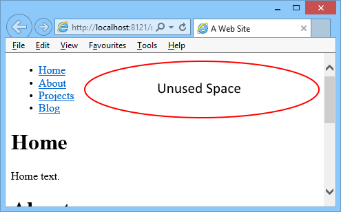
For a menu this wastes space. On a desktop or wide screen (e.g. a tablet or phone held in landscape) there is redundant space, and the menu pushes content unnecessarily below the fold (the bottom of the browser or screen):

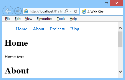
With the help of Cascading Style Sheets (CSS) the list item tags can transformed into a horizontal menu for more space efficiency, there are several ways to achieve this. The simplest is to set the <li> tag to display inline, some padding is added for a little spacing (add the <style> to the <head> section in the above example):
...
<head>
    <title>A Web Site</title>
    <style>li {display:inline; padding-right: 1em;}</style>
</head>
...
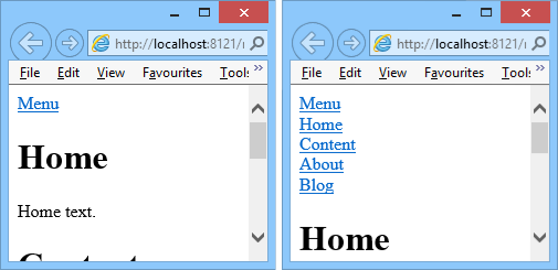
On small screens, and when the browser window is dragged small, this horizontal menu will wrap, pushing the contents down. Using some JavaScript and a little more styling the menu can be closed to a single link. Clicking the link opens and closes the menu options. This is what the Responsive Nav plugin does.
To implement Responsive Nav download the Responsive Nav zip file, extract responsive-nav.css and responsive-nav.js and link them to the web file. Wrap the <ul> menu in a <nav> tag and give it a class name, here class="nav-menu" is used. The Responsive Nav styling floats the menu elements. Finally at the end of the page call the responsiveNav function passing in the given class name:
<!DOCTYPE html>
<html lang="en">
    <head>
        <title>A Web Site</title>
        <link rel="stylesheet" href="responsive-nav.css">
        <script src="responsive-nav.js"></script>
        <style>
            .nav-menu ul { float: left; }
            .nav-menu li { float: left; }
            @media (min-width: 40em) {
                .nav-menu li { width: 70px; text-align: center; }
            }
        </style>
    </head>
    <body>
        <nav class="nav-menu">
            <ul>
                <li><a href="#home">Home</a></li>
                <li><a href="#content">Content</a></li>
                <li><a href="#about">About</a></li>
                <li><a href="#blog">Blog</a></li>
            </ul>
        </nav>
        <h1 id="home">Home</h1>
        <p>Home text.</p>
        <h1 id="content">Content</h1>
        <p>Content text.</p>
        <h1 id="about">About</h1>
        <p>About text.</p>
        <h1 id="blog">Blog</h1>
        <p>Blog text.</p>
        <!-- Responsive Menu -->
        <script>responsiveNav(".nav-menu");</script>
    </body>
</html>
Note: If the browser window doesn't shrink enough to activate the responsive menu. Add a few more menu items to the menu list to see Responsive Nav in action.

Responsive Nav supports several options, view the documentation and play with the examples to see what can be done. For example pass a string to the label setting to change the text for the default menu link:
<script>responsiveNav(".nav-menu", {label:"My Menu"} );</script>It is common for a menu to be indicated with a hamburger (menu) icon. Responsive Nav can replace the default text link to drop the menu with a custom element, like a button or img. See the demo code in the zip file.
![]()
A quick way of getting the hamburger icon is to use a similar unicode character and set that as the menu text. Unicode 2630 is appropriate, although it may not work on older devices:
<script>responsiveNav(".nav-menu", {label:"\u2630"} );</script>Plus a little CSS:
...
.nav-toggle { text-decoration: none; font-size: 26px; }
</style>![]()
This tutorial did not do any fancy formatting with the menu, use CSS to do more styling. Some other interesting menu resources:
- TinyNav.js – an alternative responsive menu.
- Adventures in Responsive Navigation – other way to do responsive menus.
See Also
- Pure CSS Menu Examples, Includes Dropdown.
- Tek Eye has some HTML articles to help new web developers.
- See w3schools.com to learn about HTML and web development.
- View the Tek Eye full Index for other articles.
Author:Daniel S. Fowler Published: Updated:


