Pure CSS Menu Examples, Includes Dropdown
On a multi-page website, a menu can help visitors find other content. A menu allows different categories of web pages to be organised under different sections. Basic website menus can be implemented as an HTML list and anchor (link) tags. In an unordered list, <ul>, each list item tag, <li>, wraps an anchor, <a>, tag. This provides a list of links to the other HTML resources on a website, or other web page locations:
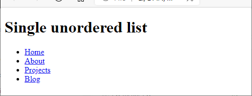
Here is the code for the above simple website page with a menu:
<!DOCTYPE html>
<html lang="en">
    <head>
        <meta charset="utf-8" />
        <title>Menu Test</title>
    </head>
    <body>
        <h1>Single unordered list</h1>
        <nav> <!-- nav tag is used to indicate a navigation section -->
            <ul>
                <li><a href="/">Home</a></li>
                <li><a href="/about">About</a></li>
                <li><a href="/projects">Projects</a></li>
                <li><a href="/blog">Blog</a></li>
            </ul>
        </nav>
    </body>
</html>
Adding some JavaScript and/or Cascading Style Sheets (CSS) to a web page allows for better formatting of a list based menu. There are plenty of examples of HTML menus on the Internet that have fancy animations, colors and effects using Javascript and CSS. However, at Tek Eye, the philosophy is to keep things simple. In this tutorial, a pure CSS menu is used to provide a dropdown menu for HTML pages. The result will be similar to this:

The CSS used to achieve the above will not use JavaScript, which means no jQuery is used, another bonus, simplifying the website code. If you want to jump straight into the completed CSS code, download the stylesheet for the pure CSS menu code used in this tutorial. It is available as a single CSS file, css-menu.css in css-menu.zip. See the code running on a CSS menu test page.
Try a Web Page with a Simple CSS Menu
Try out a simple CSS menu to start. First create an HTML file in a text editor (e.g. Windows Notepad or Notepad++) or a development environment (e.g. Visual Studio Code). Create a simple menu similar to the HTML code above. Save the file and run it in a browser to see the result.
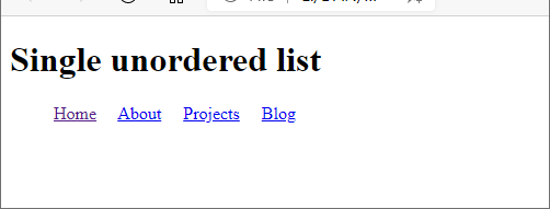
Now create a .css file that will be used to change the format of the menu from vertical to horizontal, similar to the CSS code in the responsive hamburger menu. Here, the file is called css-menu.css. Using display:inline-block achieves the horizontal, along with some spacing using padding-right:1em:
/* Change unordered list items in a nav to inline */
nav ul li {display:inline-block; padding-right: 1em;}
Link the stylesheet to the HTML file:
...
    <meta charset="utf-8" />
    <title>Menu Test</title>
    <link rel="stylesheet" href="css-menu.css">
</head>
<body>
...
Test the horizontal menu in the browser:
Add Another List for the Dropdown
Another unordered list is added under a <li> element which will become the dropdown menu:
...
<nav> <!-- nav tag is used to indicate a navigation section -->
    <ul>
        <li><a href="/">Home</a></li>
        <li><a href="/about">About</a>
            <ul>
                <li><a href="/about/contact">Contact</a></li>
                <li><a href="/about/faqs">FAQs</a></li>
            </ul>
        </li>
        <li><a href="/projects">Projects</a></li>
        <li><a href="/blog">Blog</a></li>
    </ul>
</nav>
...
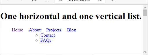
This new list will mess up the nice horizontal menu. Therefore, the CSS is changed to only affect the first child list of the nav element. This ensures the new list remains vertical:
nav > ul > li {display:inline-block; padding-right: 1em;}It also needs to be positioned so it falls under the parent list item using position:absolute, add this line to the CSS:
nav ul li ul {position:absolute;}Here is the result:
Completing the Pure CSS Menu
Notice that the horizontal list, and the dropdown, have some padding before them. Plus the dropdown has bullet points. These are removed by adding this line of CSS:
nav ul {padding:0;list-style:none;}This is the result:
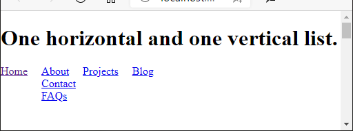
The dropdown list is then hidden until the second horizontal item is hovered over by adding these lines of CSS:
nav ul li ul {visibility: hidden;}
nav ul li:hover > ul {visibility: visible;}
The menu can now be formatted for the desired look.
Setting the CSS Menu Colors
Here is a formatted horizontal menu and dropdown menu:
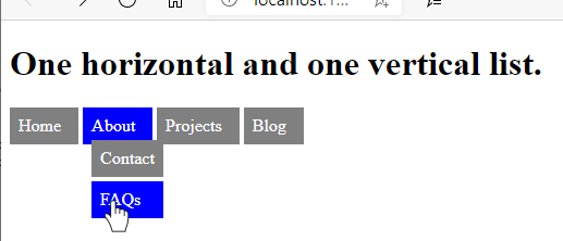
The formatting was achieved with:
/* Format the menu's look */
nav li {background:grey;padding:0.5em;}
nav a {text-decoration:none;color:white;}
nav li:hover {background:blue;}
nav ul li ul li {margin-top:0.25em;}
Making the Whole List Item Clickable in the Navigation Bar
Try out the navigation menu built from the unordered list, you will notice only the menu text is clickable. When the pointer enters the list item, indicated in this article by the li turning blue, it should be immediately clickable. How can the li be made clickable?
The trick is to make the anchor (a) element cover the whole list item element. This is done by setting the CSS display attribute on the a to block (a bonus is that the block setting will allow the dropdown menu to line up under the parent). Then the padding is moved from the li and given to the a. The whole highlighted blue area of the li is then clickable.
Full HTML and CSS Source Code
The full css-menu.css for this example is:
/* Change unordered list items in a nav to inline */
nav > ul > li {display:inline-block;}
/* Drop menu under its parent */
nav ul li ul {position:absolute;}
/* Remove list padding and bullet points */
nav ul {padding:0; list-style:none;}
/* Dropdown list invisible until... */
nav ul li ul {visibility:hidden;}
/* .. the parent list is hovered over */
nav ul li:hover > ul {visibility:visible;}
/* Format the menu's look */
nav li {background:grey;}
nav a {text-decoration:none;color:white;display:block;padding:0.5em}
nav li:hover {background:blue;}
nav ul li ul li {margin-top:0.25em;}
The full HTML file for the example is:
<!DOCTYPE html>
<html lang="en">
    <head>
        <meta charset="utf-8" />
        <title>CSS Menu Development Test</title>
        <link rel="stylesheet" href="css-menu.css">
    </head>
    <body>
        <h1>One horizontal and one vertical list.</h1>
        <nav> <!-- nav tag is used to indicate a navigation section -->
            <ul>
                <li><a href="/">Home</a></li>
                <li><a href="/about">About</a>
                    <ul>
                        <li><a href="/about/contact">Contact</a></li>
                        <li><a href="/about/faqs">FAQs</a></li>
                    </ul>
                </li>
                <li><a href="/projects">Projects</a></li>
                <li><a href="/blog">Blog</a></li>
            </ul>
        </nav>
    </body>
</html>
A Simple Dropdown Indicator
There is a simple way to add an indicator to a menu item to show that it has a dropdown sub-menu. Modern browsers have access to many named HTML entity character references that provide hundreds of extra symbols. Here are some of the symbols that can be used as a dropdown indicator:
- ▽ -
bigtriangledown - ▾ -
blacktriangledown - ⊽ -
barvee - ↡ -
Darr - ⇓ -
dArr - ↓ -
darr - ⇓ -
DoubleDownArrow - ↓ -
DownArrow - ⇓ -
Downarrow - ↓ -
downarrow - ⤓ -
DownArrowBar - ↓ -
ShortDownArrow - ⋁ -
Vee - ∨ -
vee - ⊻ -
veebar - ▽ -
xdtri
Here is ↓ added to the menu as a dropdown indicator:
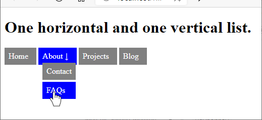
Here's the list item with the indicator in the code:
...
<li><a href="/about">About ↓</a>
...Play with the CSS code to make your own HTML dropdown menus.
See Also
- CSS Menu download
- CSS Menu Test Page
- Responsive Menu Tutorial for HTML Web Pages, No jQuery
- The CSS-only menu examples are inspired by Pure CSS Navigation on GitHub.
- For a full list of all the articles in Tek Eye see the full site alphabetical Index.
Author:Daniel S. Fowler Published: Updated:


